Well, it’s officially been a year since we posted any news on our web site. We have been busy people, but that doesn’t mean we haven’t been working on projects. We are gearing up to release a new game in the next few weeks and that has gotten me thinking about updating the web site.
I’ve been reading a lot about security issues over the last year and this move is the first step I’m taking to clean up our web site. Even though we don’t do a lot of blog posts, we do still like to write them from time to time and we need a place that supports secure connections to make things better for our community.
So here we are at our new home at WordPress.com. We will be moving all of our old blog posts here fairly soon.
If you’re like me and you’ve played a lot of PC games that were released in the late ’80s and early ’90s, you’re probably at least somewhat aware of the different display standards for PC graphics of that era. One thing that was nice about some of these old games was when they allowed you to choose which adapter you wanted to use, since they each had their own color palettes and resolutions. I’m just writing this blog post to cover some of the differences seen in a selection of old DOS games, comparing them and discussing them, and so on. I’m not really going to delve too deeply into the technical details, mainly focusing on the screen outputs, though I will give a basic overview of the capabilities of each display adapter.
CGA
The Color Graphics Adapter debuted in 1981 and was the primary display adapter used in IBM PCs for most of the 1980s. CGA supported two display resolutions and color depths, 320×200 with 4 colors (from a palette of 16) and 640×200 with 2 colors (black and white). There were some other tricks that could be used to squeeze up to 16 colors onto the screen at once, but those weren’t as widely used as the 4 and 2-color modes. For instance, you could use a 160×200 extended graphics mode that let you display 16 colors simultaneously, assuming you were okay with using the ASCII character set to draw everything. There is also a composite CGA mode that you could take advantage of if you happened to have a video card with composite output, and that would allow for the display of 16 colors simultaneously as well, though without the crispness of the more widely used RGB mode. Here’s a nice video explainer of that if you’re interested.
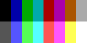
The full 16-color CGA palette
Using the 320×200 mode, you had access to two sub-palettes that gave you a selection of these 16 colors that you could apply to individual pixels. Except for the base color (black), you could select a higher-intensity, lighter version of each base color. Keep in mind that you could only display 4 of these colors simultaneously from any given sub-palette using the standard display mode. So if you absolutely needed cyan for that sweet laser sprite, you’d have to choose CGA Palette 1, and you wouldn’t be able to use the green or brown from CGA Palette 0 to draw the grass and dirt under your spaceman hero’s feet.
Cyan and magenta, together at last…
Slightly more natural colors
EGA
In 1984, perhaps after reading the correspondence from developers who agonized over having to choose between cyan and green, IBM released the Enhanced Graphics Adapter for use in IBM and compatible PCs. EGA’s palette included CGA’s palette and its hardware was mostly backwards-compatible with the CGA standard, though there wasn’t 100% compatibility. The EGA graphics modes were 320×200 with 16 colors, 640×200 with 16 colors, 640×350 with 16 colors, and 640×200 with 2 colors, all drawn from a 64-color palette.
The 64-color EGA palette (from Wikipedia)
The default EGA 16-color sub-palette was identical to the full CGA palette shown earlier, presumably to aid in backwards-compatibility. But, since you could use all 16 colors simultaneously, you would now be able to have your cool cyan laser beam and your gently waving blades of green grass atop brown dirt. In all seriousness, the difference between 4 and 16 colors is a pretty large chasm that made for a substantial improvement in graphical detail, as you’ll see later on when we get to some screenshots.
VGA
Fast-forwarding to 1987, IBM released its final industry-adopted graphics standard, the Video Graphics Array, or VGA. Nowadays, VGA is probably mainly known for being the type of cable that you plug into your video card to output video to your monitor or other display. VGA was a nice step up from EGA, as it allowed for a 320×200 resolution with 256 colors, 640×480 with 16 colors, 640×350/640×200 in 16 colors or monochrome, and 320×200 with 4 or 16 colors (for compatibility with CGA and EGA, presumably).
While EGA and CGA had fairly fixed primary palettes from which to choose colors, VGA allowed you to use your own 256-color palette, letting you choose from 262,144 possible colors, though there was a default VGA palette that devoted the first 64 colors to the default EGA colors for compatibility.
VGA’s default 256-color palette (from Wikipedia)
Thanks to the larger number of possible colors, the level of detail and sophistication of PC graphics expanded pretty dramatically. Also, consider that VGA was marketed in 1987, in an era when the NES (with its 54-color palette) was dominating the home console market. This gave the PC platform a decided advantage over the console world color-wise, until the 16-bit era began in the early ’90s.
Screenshots
This is by no means an exhaustive list. I just fired up DOSBox and did some comparisons between the CGA, EGA, and VGA modes of various games that I stumbled across or whose names made my eyebrows arch. From my delving, I found that there weren’t many games that offered all three as a display option, as most of them either let you choose from CGA/EGA or EGA/VGA. Unless otherwise noted, these will be shown in the order of CGA, EGA, VGA.
Not a great Mega Man game by any stretch, but the Mega Man character is somewhat suited to CGA’s palette. The EGA mode is definitely a lot easier on the eyes, though, and the enemies don’t blend into the background as they sometimes do using CGA.
This is the first game I found that actually used the 640×200 2-color mode. Leave it to the Bitmap Brothers. Unfortunately, the game is very difficult to play in that mode, since it’s hard to discern exactly what is what. Is that round thing that’s slowly coming at me a power-up or an enemy? Hard to tell. I actually think the EGA mode looks superior to the VGA mode, to be honest. The colors contrast a lot more, and the orange really pops out at you in the EGA mode.
I played this a lot as a kid and, of course, always opted to use the VGA mode, since my Packard Bell 486SX 25 MHz PC gave me access to that power. The CGA mode looks pretty bad, honestly. There isn’t a lot of difference between the EGA and VGA modes, other than some smoother shading in VGA. EGA once again has better contrast. The awesome music is unaffected by your display preferences, however.
Believe it or not, Sega released Altered Beast for IBM-compatible PCs around the same time that the Genesis original was sweeping the nation and urging warriors to climb out of their tombs. The CGA mode is actually decently playable, at least on the first level, though when you get into an area with a lot of background details, the playability diminishes quite a bit. There isn’t really much difference at all between the EGA and VGA modes. I’m guessing that might be partially because the Genesis was only capable of displaying 61 simultaneous colors. That’s just speculation, though. The beast transformation screen is still pretty cool regardless of which graphics mode you use.
A stone-cold classic whose VGA graphics I peered at for many hours as a young human being. The EGA mode isn’t really that bad, though the dithering does mar some of the details a little bit.
The EGA’s expanded palette helps out a lot in this game. I do kind of like the CGA title screen, though, and the dithering/shading on the worm statue is pretty well done.
Another solid game from the early days of Apogee. The CGA doesn’t hinder this particular game that much, perhaps because it’s mostly set inside of a catacomb/pyramid. The storyboard graphics look a lot better in EGA, though. That translucent pool of water looks really nice in 16 colors.
Another Apogee shareware game, Rick Dangerous delivers some solid platforming action. Once again, the CGA works surprisingly well in this one, probably again due to the fact that the action takes place in underground caverns. I’d go with EGA if I were playing it in nowadays, however.
Apogee’s fellow shareware pioneers Epic Megagames delivered a string of classic shareware titles in the early ’90s, including Jill of the Jungle. Whenever the [C]GA, [E]GA, [V]GA option came up before the game started, I’d always reflexively hit the V key, so I never knew what the game looked like in non-VGA form. The CGA mode isn’t very appealing, though the CGA mode includes light shading on the text, which EGA and VGA don’t have. VGA mode also includes that snazzy pixelated portrait of Jill, so you know your hardware is being utilized to its fullest whenever you enter a new stage.
I stumbled across this French game while doing research for this blog post. This is the only game I came across that supported both VGA and CGA, but not EGA. That’s a little unusual, and the game is a little unusual also. It might sound weird, but in some ways I preferred the CGA graphics in this game over the VGA. The CGA graphics have better contrast, so you can see more clearly when shots are fired and so on, and the characters stand out more from the background. The title screen even looks cooler to me in CGA, since it evokes that ’80s metallic aesthetic. The robots shown in the cut scenes look good in both CGA and VGA.
I’d forgotten about this game until Todd pointed it out to me. Another classic DOS game from Epic Megagames, this time a space shoot-em-up. The graphics in CGA mode on this one actually aren’t terrible, and the EGA graphics still look pretty crisp and colorful today. The standout feature of this game, though, is the Adlib soundtrack, which is very cool and gets you in the mood to mow down wave after wave of aliens with evil intentions. If you look at the screenshots, you can see that this game actually uses both of the primary CGA palettes, depending on which stage you’re playing – cyan/magenta for the metallic area and brown/green for the organic area. I thought that was a nice touch. Still a pretty fun game to play, even if it’s not as frenzied as some of the more recent bullet-hell shoot-em-ups.
Conclusion
I hope this trek down memory lane was at least somewhat entertaining. Those who also grew up sitting in darkened, EGA-lit rooms might find something to smile about at least. Thanks to Moby Games for the awesome directory that made it a lot easier for me to find some of these examples. Though I made these screenshots myself, you can visit them to find a much larger collection of game knowledge and screen captures.
Until next time.
References
Here are some of the references I used to gather information. If you want more in-depth technical details, you should check these links out.
In the mid to late ’90s, I burned a lot of time in front of one computer or another, and a large amount of this time was spent within the confines of MS-DOS. It’s obviously not the best operating system around, but it’s what my first PC had, and it was simple and straightforward once you knew the commands and were familiar with the little nuances.
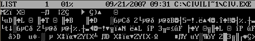
LIST is a file viewing and browsing utility written by Vernon D. Buerg, who died in December 2009. It’s simple enough. You type LIST at the command line and a nice, columned view of all the files in that directory fill the screen. You navigate between files and directories by using the arrow keys to move the cursor around. Hitting enter on a directory enters that directory, while hitting enter on a file opens that file up for viewing. Hitting the ESC key goes back to the file listing or back to the command line, depending on whether you’re viewing a file or not. There are also other commands, such as hitting E to edit the file using EDIT.COM, Microsoft’s DOS text editor.
Viewing files in LIST
This program was great when having to sort through several files and view their contents, especially text files. Just hit enter on the text file and the text immediately displayed on the screen, then hit the arrow keys or PGUP/PGDN to scroll through the file contents. Hit ESC to go back and browse through the other files in the directory.
One nice thing about LIST is that it shows the file regardless of whether it’s a text or binary file. In modern operating systems and desktop environments, this isn’t generally the case. This allows you to check for text strings within the binary that can give you a useful indicator of what the binary file is and does. An example of this being handy is in the case of some old DOS games. Some of these may have had music that was in, say, MOD format, but the music files would be named something like MUSIC00.MUS. By using LIST, you would be able to see the file’s header string and determine that yes, this is a MOD file, and now you can rename it to MUSIC00.MOD and open it up in your tracker of choice.
The header string for a DOS executable is “MZ”
Of course, now a program like this may be seen as (and probably is) a relic of the past. It’s a great example of the “do one thing and do it well” philosophy, though, and its capabilities haven’t really been replicated in any other utilities I’ve come across for modern OSes like Mac, Linux, and Win 7.
LIST’s primary job is in its name: to list files. It does that job efficiently and doesn’t get in the way. So thanks to LIST for all those nostalgic, rose-tinted memories of sitting in front of a screen of brightly lit text on a black background for hours on end, reading text files, rummaging through subdirectory after subdirectory, and checking to see if that .GSZ file is really an .EXE.
Being a fan of old-school arcade games, I spent a lot of time playing through various classics via MAME as a younger human. The Classic Arcade Hall of Fame would include such venerable hits as Galaxian, Pac-Man, Asteroids, Missile Command, and so on, but I found myself strangely drawn to the oddball games that didn’t receive the acclaim that the aforementioned garnered (rightly) with ease from casual and hardcore gamers alike.
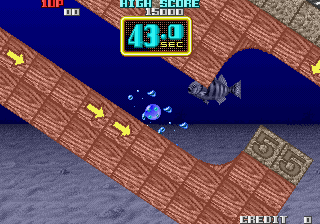
One game that I stumbled upon during one of these many late-night, bleary-eyed MAME-athons was Cameltry. (I’m not totally sure on the pronunciation. I’ve vacillated between pronouncing it “camel-tree” and “camel-try” at various points, depending on the weather and the alignment of the planets.)
Cameltry
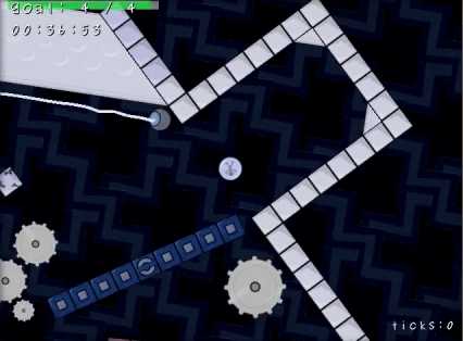
The object of Cameltry is simple: roll the ball around until you reach the exit. If you don’t reach the exit before the clock hits zero, it’s game over. There are various obstacles along the way, such as breakable blocks and tiles that sap precious seconds away from the timer. It’s a short game, but it definitely provides an ample amount of fun.
With Cameltry in mind, I set out to create a worthy homage. Turnit was the result.
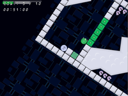
Turnit title screen
The basic idea of the game would be essentially the same as in Cameltry. You would rotate the world in order to maneuver the spherical character toward the exit. In Cameltry, though, you just had to beat the clock. With Turnit, I was wanting to have a collection aspect, where you would be required to collect a certain number of items in order for the exit passageway to be unlocked. I was hoping this would allow me to construct more puzzle-like levels, since the player would have to go searching through the nooks and crannies of each stage in order to grab the necessary items. This was possibly a mistake, since this extra complexity slowed the game down somewhat, making it less of a fast-paced arcade experience and (slightly) more of a considered experience. I never made it close enough to the finishing line to make a definitive assessment on this, however.
Rotate that playfield like you mean it!
Like Cameltry, Turnit is mainly tile-based (though underneath, it uses polygons for collision detection). To add some spice to the game, there would be time-sapping blocks, breakable tiles, laser beams, rotating beams, gears, magnets, pinball bouncers, and possibly some more that I would add later. Hitting a time-sapper would, as in Cameltry, knock a few seconds off the timer and bring you a little closer to your demise. The magnets would either cling you to them or repel you away, depending on their label. One cool feature that I thought would add some interesting puzzle elements was the colored spheres. These would roll around the level the same as the player, only they would unlock matching-colored walls if they were fitted into the appropriate slot. It’s a simple thing, really, but it seemed like this feature by itself would greatly increase the possibilities as far as designing intriguing levels and paths through which to roll.
Lots of stuff to roll around, through, and between
Of course, as is the usual course of these things (and the main reason for creating these Back Burner diaries), I stopped working on the game for a couple of years, and it receded noiselessly into the background. Once I was finally able to begin working on it again, I ran into some difficult bugs that I wasn’t able to iron out to my satisfaction, which kind of soured me on the whole thing. This was partly due to the fact that I was using a few different libraries (Chipmunk, OpenLayer, and Allegro), some of which had become incompatible with later versions of the other pieces. Todd helped me quite a bit by creating a version that worked with Allegro 5, but by that time I was ready to throw in the towel.
Saying goodbye to Turnit was kind of bittersweet for me. I thought it could have been a pretty awesome game if it was competed. It was one of the few games I ever worked on (along with vGolf and Dot to Dot) that I just really enjoyed playing. There was a lot of potential here, but alas, such is the way of things.
Below is a video of the last version that shows a brief glimpse of Turnit’s gameplay. The frame rate is off a little bit, so it looks slightly sped-up, and there is no sound. Until the next episode…
Anyone who has programmed or done any kind of work for any length of time has what is often referred to as the “back burner.” It is here that projects that one has lost enthusiasm for working on or have grown beyond their intended scope (or insert other excuses here) are placed, to be worked on at a later date. Unfortunately, as many have discovered since the microprocessor was first unleashed on the world multiple tens of years ago, this later date often never comes, and so these projects end up languishing. There they sit, in a directory we used to browse through daily and whose contents we knew intimately, gradually fading from our priorities until they eventually wither and fall off the stem. Years later, we stumble across an old .zip file filled with source code and graphics, and we’re reminded of what could have been had we had the tenacity to finish the job, right before we go back to the more pressing concerns of the present day.
The preceding paragraph was an overly verbose way of saying that there’s a lot of stuff that we start but we never finish. Cool ideas dissolve into the mists. Bleary, dark-circled eyes stare into the distance, perhaps as the brain they’re attached to imagines what these ideas would have formed into if they were given a chance to blossom.
There are several projects in the archives of T³ Interactive that have sat lonesomely on that back burner for many years. One such game is Cloud Skipper, a simple Java-based arcade game inspired partly by Icy Tower.
Title screen for Cloud Skipper
The goal in the game would be simple: reach the upper layer of the atmosphere without falling to your death. This climb could be achieved by leaping from cloud to cloud, reaching progressively higher altitudes. There would be no scoring other than the current altitude and a timer that would record how long it took you to make the journey.Cloud Skipper was destined to be an arcade game in the strictest sense, at least as I originally envisioned it.
Game Mechanics
The gameplay in Cloud Skipper would be very arcade-like, with a player-controlled sprite who would skip along the clouds (hence the name) as he made his way skyward. You begin each game on the ground, and the only thing you see are random clusters of clouds floating across the playfield. The catch is that once you land on a cloud segment, that piece of cloud will disappear, forcing you to leap to another one. In theory, this would increase the action and force the player to continually move. You get about half a second or so once you land on a cloud segment before it evaporates, so you have a bit of leeway, but not that much. Once the player reaches an altitude of 20,000 feet, he wins the game. If you manage to fall off the bottom of the screen at any point along the journey, you’re met with the dreaded Game Over.
Starting at ground level…
I decided to simplify things and make both the cloud segments and the player circular. I did this for two reasons. One, detecting collisions between circles is pretty straightforward, and I already had collision-detection code for circles from previous projects (vGolf and Dot to Dot, and probably some other ones I’m forgetting). Two, making everything circles would simplify the leaps for the player since they would be aiming for objects with uniform shapes (with differing sizes) throughout the adventure.
One thing you’ll notice if you play the game is that the clouds wrap around to the other side of the playfield once they go off the right edge of the screen. This ensures that there will generally be at least somewhere you can leap to, though it may be difficult to do so successfully, and if you just miss hitting a cloud segment before it glides past the edge, you’ll always have another shot at it once it reappears on the opposite side.
Graphics
The graphics for this game were meant to be very simple and cartoon-y. In fact, everything that shows up on the screen during the main game (with the exception of the player sprite, the Game Over image, the moon, and the victory sequence) was created using Java graphics primitives. As you scale higher and higher, the background gradient darkens, signalling the thinning of the atmosphere, and the moon’s visibility becomes more prominent. As you can see from the screenshots, I decided to make the playfield more vertically oriented, since the game is focused on continuous upward movement.
Movin’ on up…
The HUD is rather sparse, but the player doesn’t need that much information in this game. To the right is a gauge that indicates how high up you are presently and how much further you have yet to ascend. There are two white lines on this bar, one showing the current highest-reached point, and the other demarcating how far you can fall before you drop off the screen and to your death. Centered at the top of the screen is a display of the current altitude, in feet, and the current time elapsed in this game session.
Highlighting the cloud segments
I wanted to make sure that the cloud segments were differentiated so that the player could discern when he’s standing on one specific segment. Since I made all the clouds in the game white (possibly a bad decision), I decided to add little gray arcs along the top of each cloud segment to make the division between them clearer, especially in large bunches.
That guy looks familiar…
When you reach 20,000 feet and land on the top of the atmosphere, you’re treated to a little dance by Cloud Skipper‘s rotund hero, and the moon in the background sends a cheesy grin toward you across the vacuum of space.
Time to celebrate!
Conclusion
I had a lot of fun working on this one, and it may not technically be considered “on the back burner” since the main game itself is basically complete. The gameplay is a little rough, because there are many times where you will land on one cloud segment and several adjacent segments will disappear all at once, putting you in immediate peril. Plus, the randomness of the clouds means winning isn’t always a matter of pure skill so much as getting lucky in the cloud placement. It is somewhat entertaining, though, and I think it could have been molded into something better if I had the time and inclination to smooth out the rough edges.
If you have the Java browser plug-in installed, you can can play it here if you so choose. The controls are the left and right arrow keys and Z to jump. (For testing purposes, I left these cheat keys enabled: W for a big jump and Q for a massive jump.)
Thanks to Todd for giving me the idea to do this write-up. Until next time…
It was a couple of years ago when I first laid my eyes on what would become WordLeap. As often happened when I was visiting Travis, we started talking about the things we had been working on. Travis showed me one of his unfinished projects titled Vocabuleaper.
I was quite impressed with Vocabuleaper as soon as Travis started showing me how the game played. It immediately struck me as a game that I would like to see finished. After seeing how our recent collaboration on vGolf turned out, this project seemed like another perfect project for me to finish up. I was focused on developing Paintball Party 2 at the time, but I made a mental note of my desire to work on this project at a later date.
Pretty soon after that I began hearing news of a new indie game marketplace called Indievania. In the mean time, there was talk among the Allegro developers of an Android port. Vocabuleaper seemed like a perfect fit for mobile devices. I figured I could work on a PC version of the game and release it on Indievania. By the time I was done with that, Allegro would be ported to Android and I could release a mobile version.
With motivation in place, it was time to start thinking about how to take Vocabuleaper from its current state into a finished product. I quickly whipped up a prototype to get the ball rolling on this project. It was at this time that I decided to title the project WordLeap, so named because I vaguely recall Travis mentioning that WordLeap was an alternate title and the game files suggested to me that was also the case.
Expansion
After I had the basic game implemented, I started to think about features I would like to see in a game like this. The original game was about the challenge of making awesome words and trying to get the high score. While I would consider a game like that complete, I wanted to try something I hadn’t tried before.
A few years ago I played a game called Hotel Hell which left an impression on me. That game, though quite simple and short, had some elements which made me feel like I had been somewhere. Hotel Hell was a memorable place to me, so memorable that I consider it a good game despite the mundane gameplay mechanics.
While I couldn’t quite place exactly what made the game that way for me, I was able to hone in on the feeling I got from it and associate that with some of the other memorable experiences I have had in gaming. The Metroid Primes are good examples of the kind of games which made me feel like I had been somewhere. That is a feeling I wanted to evoke in the players of WordLeap.
My early gaming experiences would also play a role in the design of WordLeap. While there are a lot of things I like about games, the one thing that stood out to me the most was the sense of discovery, of wanting to experience what lies beyond the exit. It was the thought that there was some amazing visual or aural experience in the next level that motivated me to push through the challenges.
One final influence that deserves a mention is Lumines Live! It is a game where no attempt is made to tie everything up into a nice little narrative, a puzzle game where the main focus is on getting the high score. It provided a sense of discovery through the unlocking of new skins as you got to higher levels. This is something I really liked and helped cement the idea I had for what I wanted to do with WordLeap.
The main game would naturally become a sort of story mode where the player must face increasingly difficult challenges to make their way through various places. The challenges would be abstract representations of what someone would face on a real journey. The idea of the player trying to reach enlightenment was ultimately the result of our brainstorming sessions.
The feeling I wanted the game to have, the amalgamation of the feelings from the influences described above, would come from changes in scenery and music as the player progressed through the levels. The gameplay would be essentially the same throughout, only adding in extra elements along the way to increase the challenge.
Now that I knew what game I wanted to make, it was time to start developing it, programming all of the systems I would need to make this vision a reality.
Development Challenges
The first challenge I faced during development was coming up with a way to handle the levels. Travis laid his vision for how the levels would look in an e-mail he sent me when we first started working on the project.
The way I was thinking of doing the backgrounds would be using basic polygon shapes. Have 2-3 layers of parallax and have the playfield appear to scroll up and to the right. For instance, the first level might have just mountain-like green polygons. The second level could have polygons that are rectangular and look like buildings. The third level could have polygons that look like trees. When you finish a level, there would be some kind of transition effect and it would scroll seamlessly into the next background type.
There were a few mock-ups like the one below attached to this e-mail which would ultimately inspire my solution:
He mentioned wanting to use fractals, but I quickly dismissed that possibility after doing a little research. It seamed like a rather complex solution. Instead, I thought it would be cool to have a shape palette for each level. We could generate the background by randomly picking a shape from the palette and placing it next to the previous shape. Each shape would be required to line up at a specific point to ensure the shapes would all fit together seamlessly. This solution wound up working rather nicely.
One of my favorite tricks with hardware accelerated graphics is using greyscale textures and applying color to the polygons to give the final result. I knew I wanted the level transitions to be seamless so I put that trick to good use. All shapes in the shapes palette are greyscale. This made it possible to smoothly fade between levels. I was very pleased with how this all turned out.
The Touch Effect
After I had finished what I thought was most of the coding, I decided to try and get the game running on Android. Allegro’s Android port still had a lot of rough edges at the time, so it took me quite a while to get it set up. I did manage to get the game running and was met with some disappointing results when I attempted to play the game.
I imagined the game would work rather naturally with touch controls, but I found that it was very hard to play. My initial disappointment quickly faded and I went into problem solving mode. This is where I made one of the biggest changes to the game, resizing the game board from 10×10 to 7×7. This was a difficult change, since I didn’t design the game (I have a tendency to not want to alter someone else’s work), but I knew it would be necessary if we wanted to have a single version of the game on mobile and PC.
Now it was a lot easier to touch the tile you wanted, but this wasn’t enough to fix the game. Since your finger is in the way when you touch a tile, you can’t be sure you have touched the correct tile. This was remedied by implementing what I call a touch helper, a little bubble that pops up above your finger indicating the contents of the touched tile.
With these changes in place, the game was actually playable, but playing with touch was slower than playing with a mouse. I needed to do something to keep my vision for parity between all versions of the game intact. This is when I decided to change the game from a timed system to a move-based system.
Originally, the life bar acted as a timer that would decrease slowly until it ran out and ended the game. This was changed so that the life bar acted as a move counter instead, decreasing with each move you make. This change would ensure that one platform wouldn’t have an advantage over another and we could have a single set of leaderboards shared amongst all versions.
Tidbits
After having finished most of the game, I thought it would be cool to include a music player mode. This ended up being the unlockable Music mode. I thought it would be a cool way to relive the adventure in a passive way. I think the idea came from not only the music test mode in old console games, but also games like Metal Gear Solid 2: Substance (Casting Theater) or Metroid: Other M (Theater Mode). The mode was later renamed to Scene mode since it reminded me of old demo scene demos that featured cool artwork and MOD music.
I added an Unlock Content option to the profile screen to allow players to unlock all of the content without having to play through the story mode. After reading an article on Kotaku about one player’s frustration with locked content in certain types of games, I decided this would be a good feature to add. Not all players are going to be interested in playing Story mode, and those players should still be able to enjoy all of the available content.
Conclusion
Working on this project has been a great experience for me. I enjoyed managing the project, coding, and doing music and sound. It was a lot of work, but I am very happy with the way the game turned out. I am reminded of the days when we used to take turns on the old Packard Bell 486 SX 25, trying to make our dreams a reality.
Controls in video games have always been an important area of focus for me as a game developer. Maybe it’s the countless hours of gaming over the years that have molded my idea of how games should control, but to me it is intuitive. The idea when programming controls is to understand what the player wants to do based on the input you are receiving from them. Controls are a fundamental part of video games and should be well thought out.
I was recently looking around in the Nintendo eShop and came across a game called I Must Run. It looked like fun, and for a couple of bucks I figured it was worth the gamble to try it out.
I Must Run is an auto-run platformer similar to Canabalt and BIT.TRIP RUNNER. Your character automatically runs and you have to react in various ways to keep from getting killed. You have the ability to jump, punch, and slide, and you will need all of these moves in order to survive.
The game is pretty good, overall, but there is one very annoying issue with the controls that keeps me from thoroughly enjoying the game: when I press the slide button, it only slides if I happen to be on the ground before the button press occurs. The entire design of the game centers around anticipating what’s going to happen next and reacting quickly. Having to focus my attention directly on the character sprite, waiting for him to land before giving him the next command is a serious design flaw.
As a player, my intentions are clear. When I press the slide button, I want to slide. There is no good reason for the game not to recognize this fact and act accordingly. From a programming perspective, it would only take, at most, a few lines of code. This leads me to the conclusion that the developer didn’t consider player intention when programming the controls. By not doing so, the developers held this game back from being great.
I am a huge fan of the Super Mario Bros. series of games. I have played every game in the series, most of them fairly thoroughly. The one game in the series that I missed was Super Mario Land for the Game Boy.
I recently obtained copies of all three Super Mario Land games from the Nintendo eShop and have been playing through them. I had played the latter two before but hadn’t really thought too much about the design of the games. After playing through all three games recently, I noticed how the Super Mario series has progressed over the years.
In the original Super Mario Bros. you simply wanted to get to the end of the game and defeat Bowser. How you get to the end was up to you, but you had no other explicit goals. Super Mario Land pretty much replicates this design without deviation.
Super Mario Land 2 introduces secondary goals which are conveniently tallied up for you on the file select screen, much like Super Mario World. In Super Mario Land 2, secondary goals consist of finding secret exits in the levels that open up paths to additional levels. Many of the secondary goals are not revealed explicitly in the game Unlike Super Mario World, there is no way to know where to look for many of the secondary goals or whether you have finished all of them.
Super Mario Land 3 takes secondary goals into their current state. Firstly, they’ve added a treasure collecting aspect to the game. You can clearly see all the treasures you have each time you complete a level. Secondly, levels with secret exits are clearly marked on the map screen, much like Super Mario World. Thirdly, the game tells you to “PLEASE RETRY” when you beat the game if you haven’t completed all of the secondary goals. And lastly, after beating the game, the levels that contain treasures that you haven’t gotten yet are now marked so you know exactly where you need to be looking to complete the rest of the goals.
What separates this game from previous games in the series is that you are basically told that you aren’t done yet if you haven’t completed all of the secondary goals. Newer games in the series further integrate secondary goals into the game, giving the player the impression that they aren’t done until all of the goals are completed. For instance, Super Mario World 2, the next game in the series, gives the player a score for each level (up to 100). The secondary goals are the same for each level, find a certain number of certain types of items. As a gamer, seeing less than 100 compels me to go back in and try to get everything.
All of the newer Super Mario games have these integrated secondary goals that keep you playing until you have done everything there is to do. This is what Super Mario is these days. To me, Super Mario Land 3 represents the moment when the Super Mario series went from being an adolescent to being a young adult.


 He mentioned wanting to use fractals, but I quickly dismissed that possibility after doing a little research. It seamed like a rather complex solution. Instead, I thought it would be cool to have a shape palette for each level. We could generate the background by randomly picking a shape from the palette and placing it next to the previous shape. Each shape would be required to line up at a specific point to ensure the shapes would all fit together seamlessly. This solution wound up working rather nicely.